
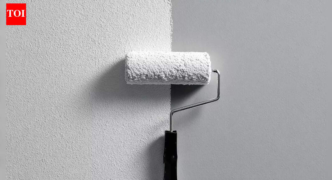

Interior wall colours can shift throughout the year, but winter creates the most dramatic change. Shorter days, weaker sunlight and a cooler natural light tone make paint appear deeper, duller or noticeably darker than it does in brighter months. This happens because reduced daylight limits how much light paint pigments can reflect, altering the way colours are perceived indoors. Artificial lighting, which is used more in winter, also affects how shades look by enhancing warm or cool undertones. These seasonal changes are completely normal, but understanding them can help you choose colours that stay consistent. Testing paint samples in different lighting conditions, especially during winter, ensures the final shade looks right all year.
How winter light changes the way paint looks
During winter, natural light becomes weaker, cooler, and more angled. Shorter days and cloudier skies reduce brightness, meaning indoor spaces receive less intense illumination. With less daylight entering the room, paint pigments do not reflect as much light, causing colours to appear darker or greyer.In addition, winter sunlight has a higher blue tone. This cooler quality shifts the appearance of warm paint shades. Soft creams may look slightly beige, blush pinks can appear muted, and pale yellows often turn more subdued. Even bright whites may seem less crisp, taking on a blue or grey undertone. This natural seasonal shift can dramatically alter the overall ambience of a room.Recent research from Benjamin Moore’s “The science of light and its impact on paint colour specification and IEQ” explains that light is not just a backdrop; it shapes the very way we perceive colour on walls. Changes in daylight intensity, direction, and colour temperature throughout the day or across seasons can dramatically alter how a paint looks. Artificial lighting adds another layer of complexity by shifting the hue and brightness depending on bulb type and finish. That means a shade you love under summer sunshine might look unexpectedly different during a dim winter evening.
Why artificial lighting makes colours look deeper
As daylight decreases, homes rely more on artificial lighting. Warm artificial lights such as incandescent or warm LED bulbs, enhance yellow and red tones, making paints appear richer and deeper. Cool LED or fluorescent lighting, however, enhances blue and green undertones, causing some colours to appear darker, cooler, or even slightly dull.The type and position of indoor lighting also influence paint perception. Overhead lights create shadows on vertical walls, while lamps and sconces brighten specific areas unevenly. All these factors together make wall paint appear darker during winter than in bright summer months.Although colour perception is primarily driven by light, winter’s lower humidity and colder temperatures can subtly impact how surfaces absorb or reflect light. Dry air can reduce surface sheen in certain finishes, especially matte paints, giving walls a slightly deeper look. While this effect is minor compared to lighting changes, it still contributes to the overall darker appearance.
Choosing paint colours that stay consistent all year
Understanding seasonal light changes helps you select colours that look good throughout the year. Choosing the right tone involves considering how the paint interacts with both natural and artificial lighting in your home. Testing shades on different walls at various times of the day is essential, especially during winter when the environment is least forgiving.Opting for neutral tones with balanced undertones can provide more stability across seasons. Colours with a slight warm base tend to counteract winter’s cool natural light, maintaining vibrancy even when daylight is limited. Lighter shades with soft undertones also help reflect available light better, preventing the room from feeling too dark.If a deep colour is part of your decor plan, using it strategically on accent walls or well-lit rooms can help maintain balance without overwhelming the space during winter.
How to ensure your final choice works in winter and summer
The best way to choose a reliable colour is to observe paint samples in both natural and artificial lighting. Paint swatches should be viewed during different times of the day, particularly morning and late afternoon, when winter light is most subdued. This helps you understand how the shade adapts to various lighting conditions.Testing multiple sample patches instead of tiny cards allows you to see the true effect of saturation and undertone. If the colour appears significantly darker in winter, choosing one shade lighter often solves the problem while still giving the desired effect.Rooms with limited windows benefit from lighter, warm-based colours to brighten up darker corners. Meanwhile, rooms flooded with sunlight can handle cooler or deeper shades without losing their vibrancy.